My Works
NIFPlay Website Redesign
Ten years of content. No system to surface it. No room for what the organization had become.
Period
Feb — May 2026 · 10 wks
Tools
HubSpot · Figma · Notion
Impact
30+ Pages · ↓3→1 Clicks
The Problem
The site hadn't changed in a decade. The organization had.
THE BRIEF
Move the content to HubSpot, clean it up, launch fast.
WHAT I FOUND
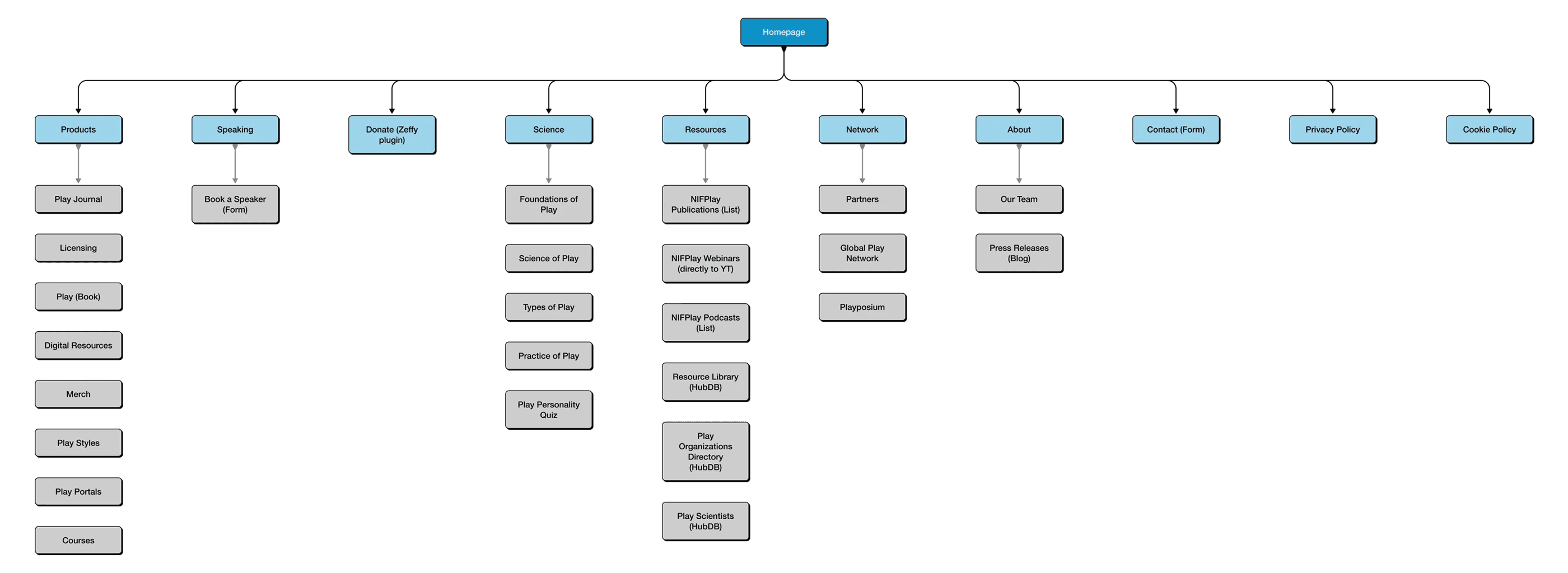
A site organized around content type, not user intent. Speaking buried under About Us. Donate three levels deep. New products with no entry point at all.
The homepage led with a four-column grid of Publications, Podcasts, Webinars, and Book a Speaker — equal weight, no hierarchy. It read like an archive maintained by people who already knew where everything was. Five top-level items. None of them said "Speakers."

Before

Before — content-first architecture; After — business-intent architecture
The Decision 01
Organized around intent, not content.
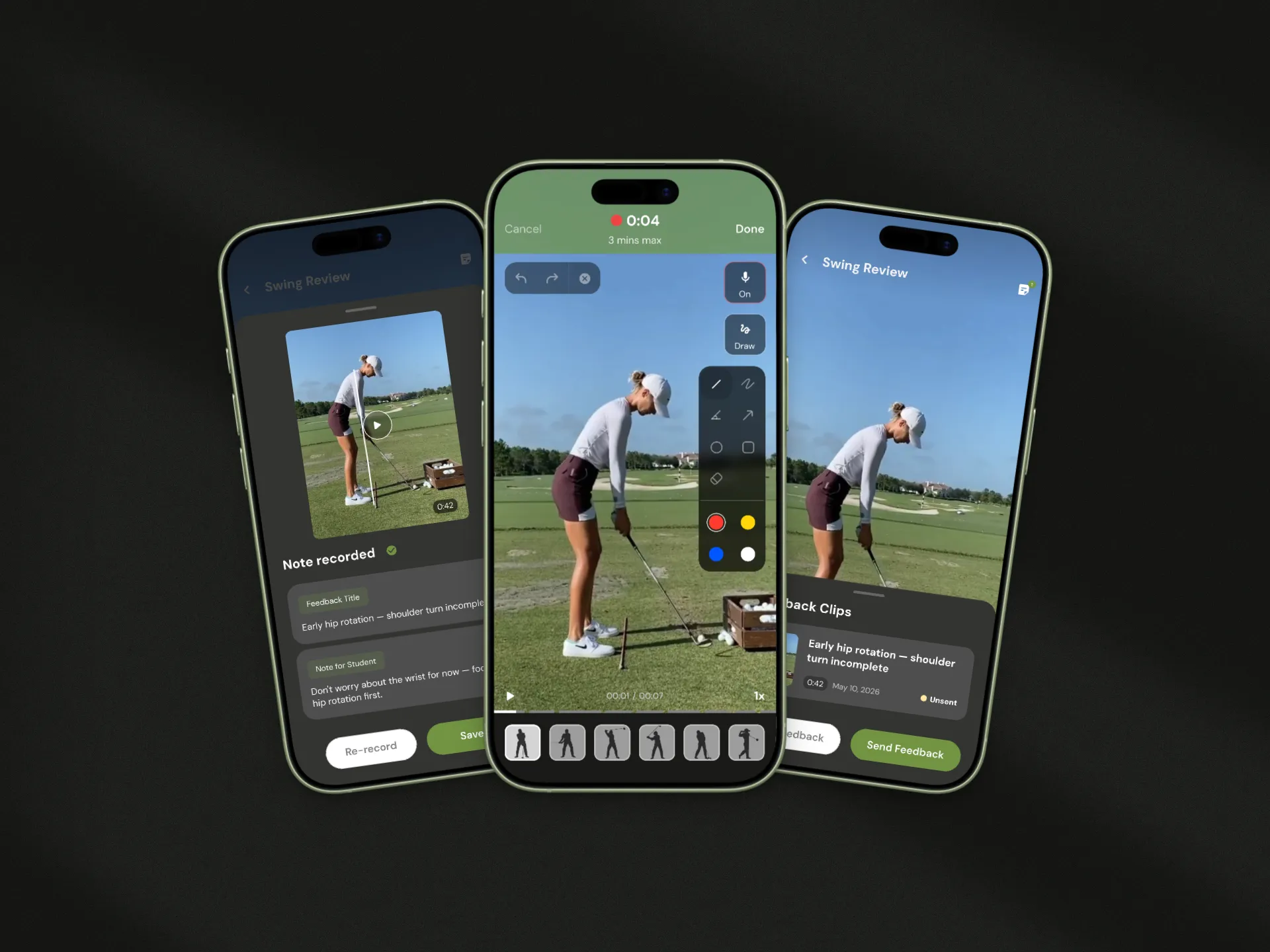
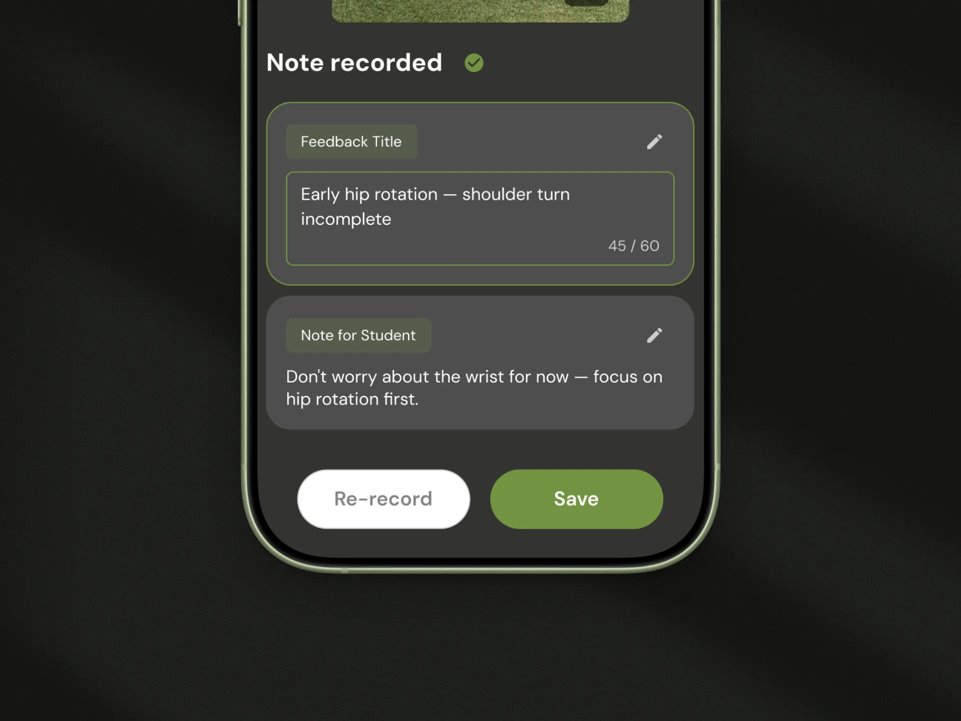
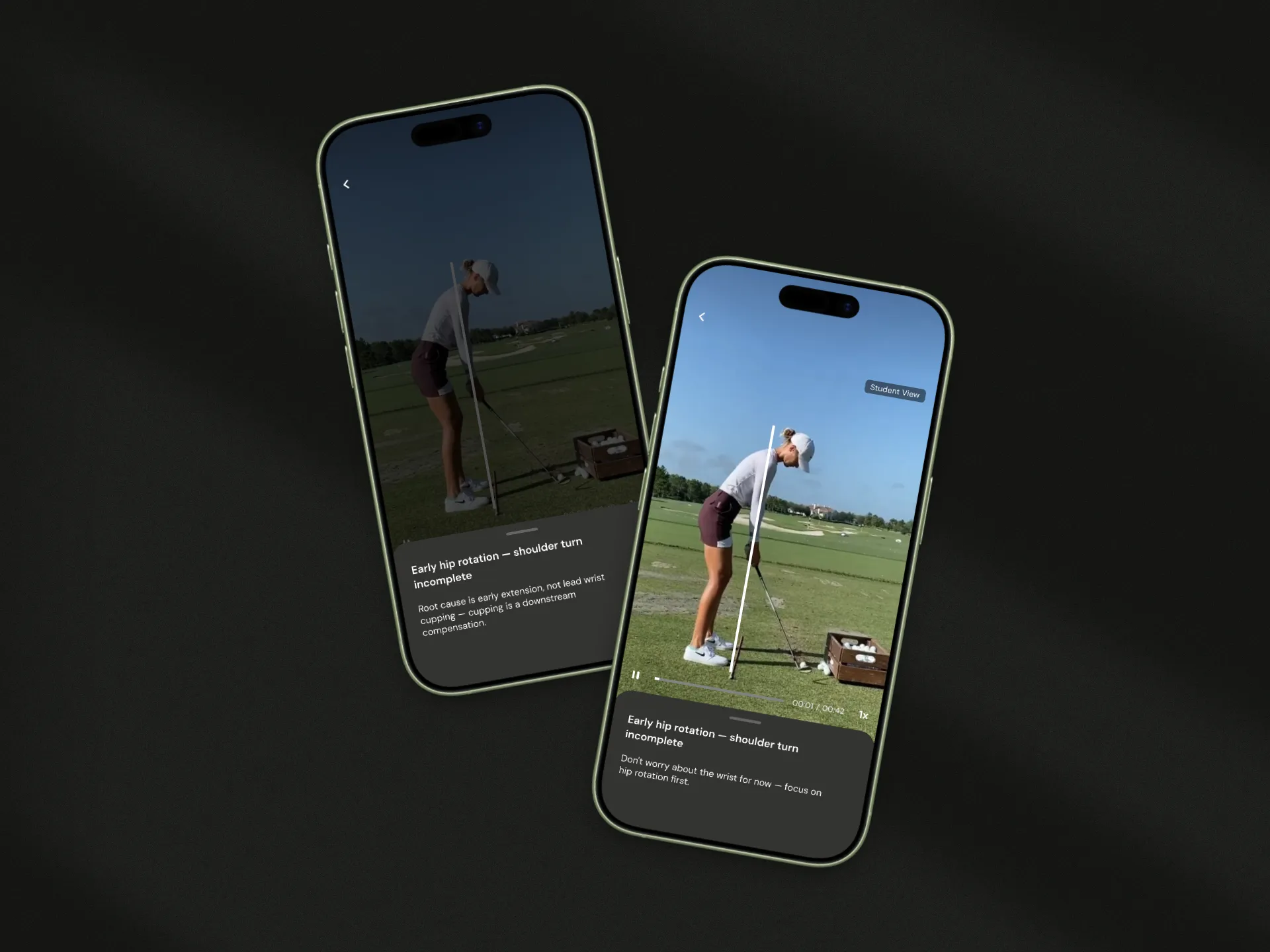
The site needed a different organizing principle before it needed a new design. I rebuilt the information architecture from scratch: seven top-level sections organized by what visitors come to do, not by what the organization has. Speaking, Products, and Donate elevated to top-level navigation for the first time.
Book a Speaker: three clicks to one.
The Decision 02
Brand color as signal, not noise.
NIFPlay has a strong visual identity — bold, saturated, energetic. The question wasn't whether to use it, but where.
Early homepage directions ranged from minimal to color-forward. Through iterative review with the CEO, we aligned on a middle path informed by how organizations like Headspace and Slack deploy strong brand identities on the web: high-saturation color reserved for moments that need to land hardest, cleaner backgrounds everywhere else.
The hero went white. Brand color became punctuation. The result feels like NIFPlay — without reading like a legacy nonprofit site from 2014.

Early direction …… Live
The Impact
A 10-year-old site. Relaunched in 10 weeks.
10 weeks
Brief to full launch
30+
Pages delivered end-to-end
↓ 3 → 1
Clicks to reach "Book a Speaker" from homepage
Delivered within a 10-week engagement — one designer, no engineering team, 30+ pages built end-to-end. Scope expanded mid-project to include three HubDB-powered directory pages (Resource Library, Play Organizations, Play Scientists) originally slated for Phase 2, absorbed without a timeline slip. Redundant hosting costs eliminated at launch. The team maintains and scales the site independently, no developer required.
Reflection
What I'd do differently.
The visual design was scoped to the homepage — the right call for a 10-week timeline. What I'd close next time: establish conversion tracking before launch, not after. Traffic data existed through the migration, but speaking inquiries, donations, and product sales through the site are still being baselined. I know the architecture works. I'm still building the proof.