My Works
Torus Design System
The design system wasn't broken. The system of using it was.
Role
Product Designer
Timeline
Sep–Dec 2025 · 10 weeks
Tools
Figma · Notion · Stark
Impact
11 Components · WCAG AA
The Problem
Five failures in production. One root cause.
THE BRIEF
Make the design system WCAG 2.1 AA compliant. Two months. I came in knowing nothing about accessibility.
WHAT I FOUND
I started where my mentor pointed me: audit the production platform directly. Zoom to 200%, tab through the site with a keyboard, see what breaks.
The accessibility failures were real — broken tab order, content clipping, interactive elements unreachable by keyboard. But comparing the production platform to the Figma library surfaced something more fundamental: they didn't match. Engineers had built their own components outside the system because the library didn't have what they needed. The components that did exist were missing states. The system had a library. It had no authority.
Patching accessibility onto a system nobody was using wouldn't hold. The root problem wasn't component quality — it was adoption.
01
Incoherent Variants
Components built ad hoc, no shared visual logic.
02
Pattern Duplication
Same interaction pattern in three different forms.
03
Semantic Conflicts
Buttons used as links. Links styled as buttons. No rules.
04
A11Y Failures
No keyboard navigation. No ARIA labels. No focus states.
The Decision
I chose to fix the foundation first.
Accessibility was the ask. But I made a call: if the system itself wasn't trusted or used, compliant components would become compliant noise.
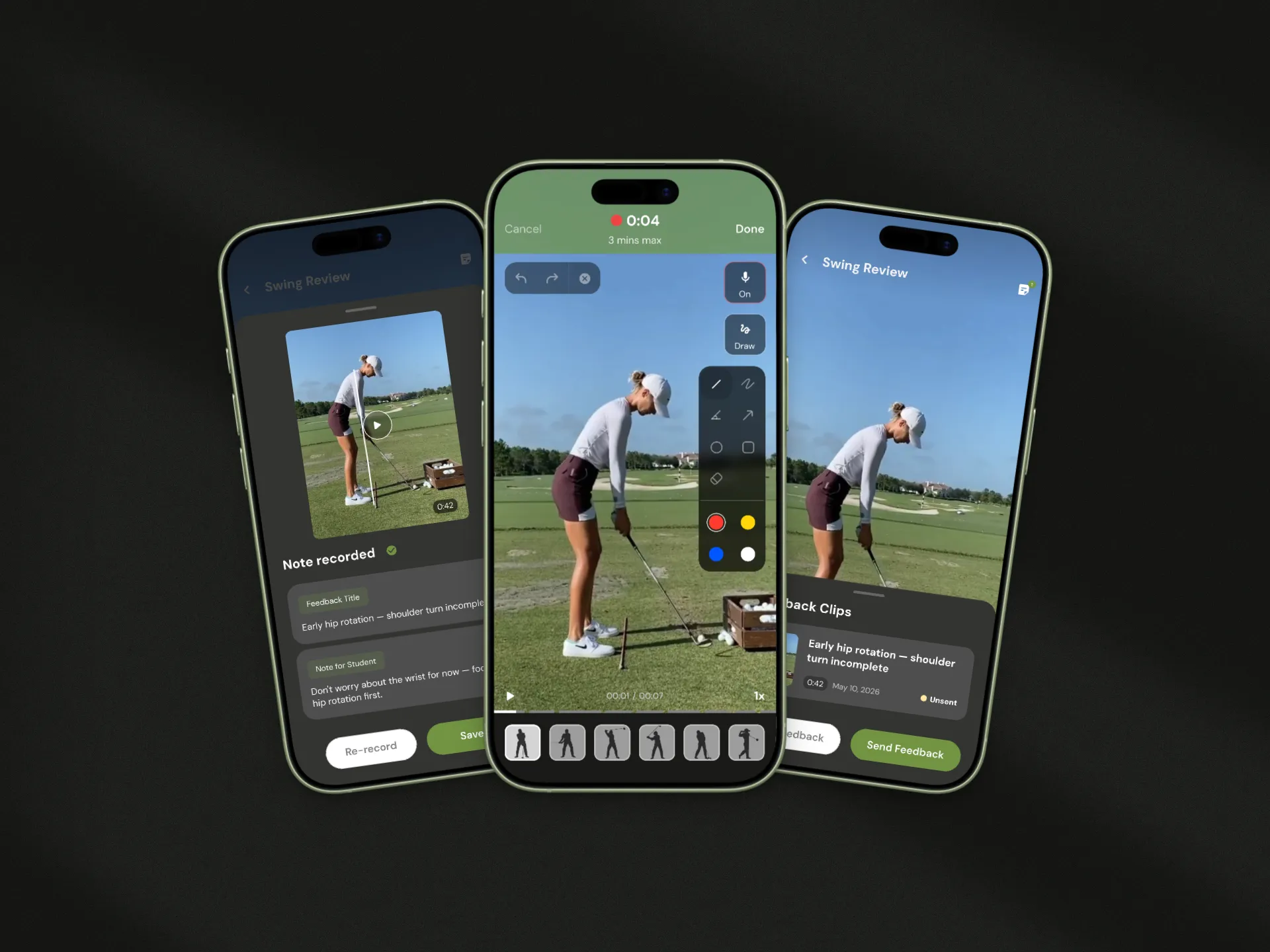
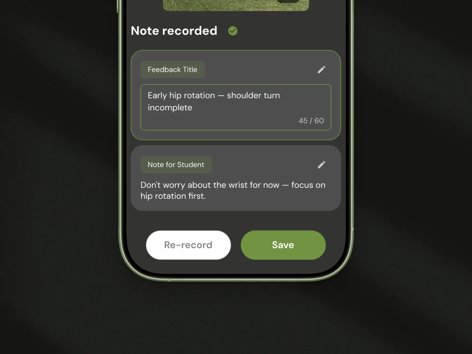
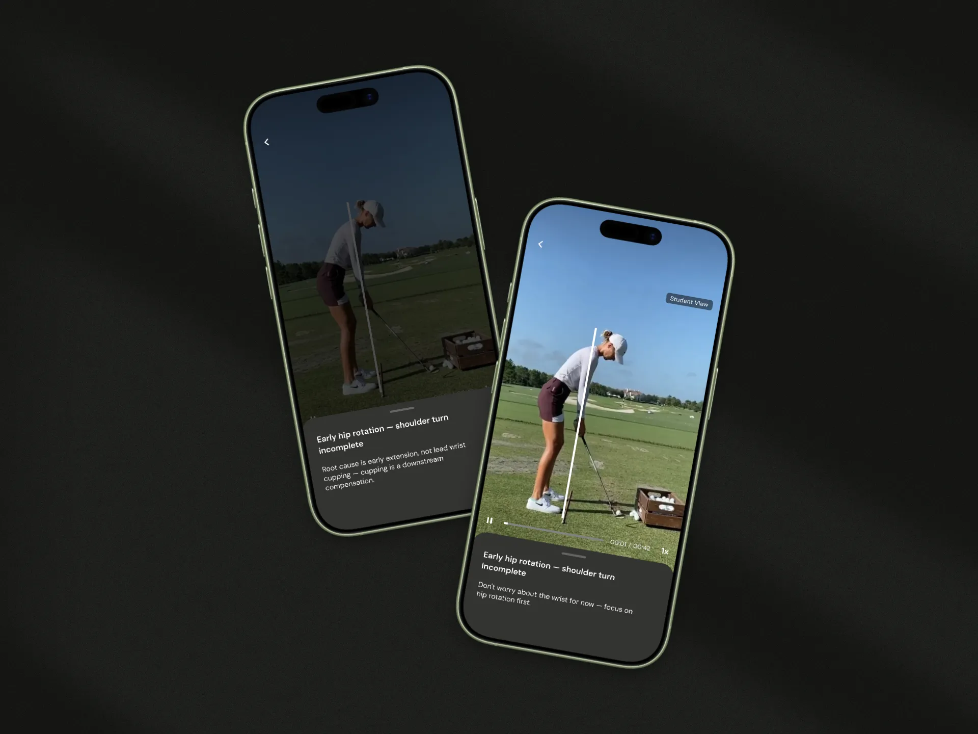
I expanded the scope — without being asked to. Instead of patching the existing library, I rebuilt it from the ground up: a three-layer documentation framework (Usage, Specs, Accessibility) applied consistently to 11 core components. The accessibility specs didn't live in a separate doc — they were embedded directly in the Figma component panel. Every component shipped self-contained.
The risk was real. Two months isn't a lot of time to rebuild a system. I prioritized ruthlessly — 11 components covering the highest-impact patterns, nothing more.
The System
A system that teaches itself.
Every component ships with its own instructions. Developers don't need to ask. Designers don't need to guess.
01
The Framework
Every component in Torus is documented across three layers: usage, specs, accessibility. This structure isn't cosmetic. It's a contract between design and engineering.

02
Semantic Foundation
Buttons trigger actions. Links navigate pages. These aren't style choices — they're structural rules. Before Torus, both were used interchangeably. I established a strict semantic distinction and documented exactly when to use each, with visual examples built into the component.

03
Accessibility Architecture
Accessibility in Torus isn't a checklist. It's embedded into the component spec itself. Color contrast ratios, keyboard tab order, and ARIA labels are defined at the component level — not added after the fact.

04
Interaction States
A component without states isn't a component. It's a sketch. Every element in Torus ships with Default, Hover, Focus, Pressed, and Disabled states — the complete set needed for keyboard and assistive technology users.

05
Self-Documenting
Usage rules, logic notes, and accessibility specs are embedded directly in Figma's component panel — so the system works without a meeting, a Slack message, or a handoff doc.

The Impact
11 components. Zero guesswork. Used in production.
11
Foundation components built and fully documented
WCAG AA
100% coverage across all 11 components
10+
Designers and engineers adopted the system
10 weeks
From audit to delivered system
Jessica Fortunato
Senior UX Designer, OLI
Heather Taylor
Senior UX Designer, Accessibility Lead, OLI
Jessica Fortunato (Senior UX Designer) learned from the usage and accessibility guidelines and actively references them when designing pages — using the system for real judgment calls, not just as a lookup.
Heather (Senior UX Designer, responsible for WCAG 2.1 compliance across the entire OLI platform) reviewed the accessibility architecture and confirmed it covered what it needed to, clearly. For a platform with real compliance obligations, that review matters.
Reflection
What I'd do differently.
This project taught me that a design system's biggest challenge isn't technical — it's organizational. Building components is the easy part. Building something other people will actually follow is the real work. If I had more time, I would have tested the system itself — watching designers and engineers use my documentation to build something new, without asking me a single question. That's the real measure of whether a design system works. I also would have gone further on the engineering side: the accessibility specs I documented were designed to map directly to code, but I didn't have the bandwidth to validate that handoff with the dev team. The question I still think about: when a system is handed off, who owns making sure it stays accurate?