I spearheaded a fundamental shift in the Torus Design System by moving accessibility from an "after-the-fact audit" to a core technical requirement. In just two months, I audited and rebuilt 11 core components to be WCAG 2.1 AA compliant, establishing a shared technical vocabulary that eliminated handoff friction and ensured the platform's long-term scalability.
project specs
context:
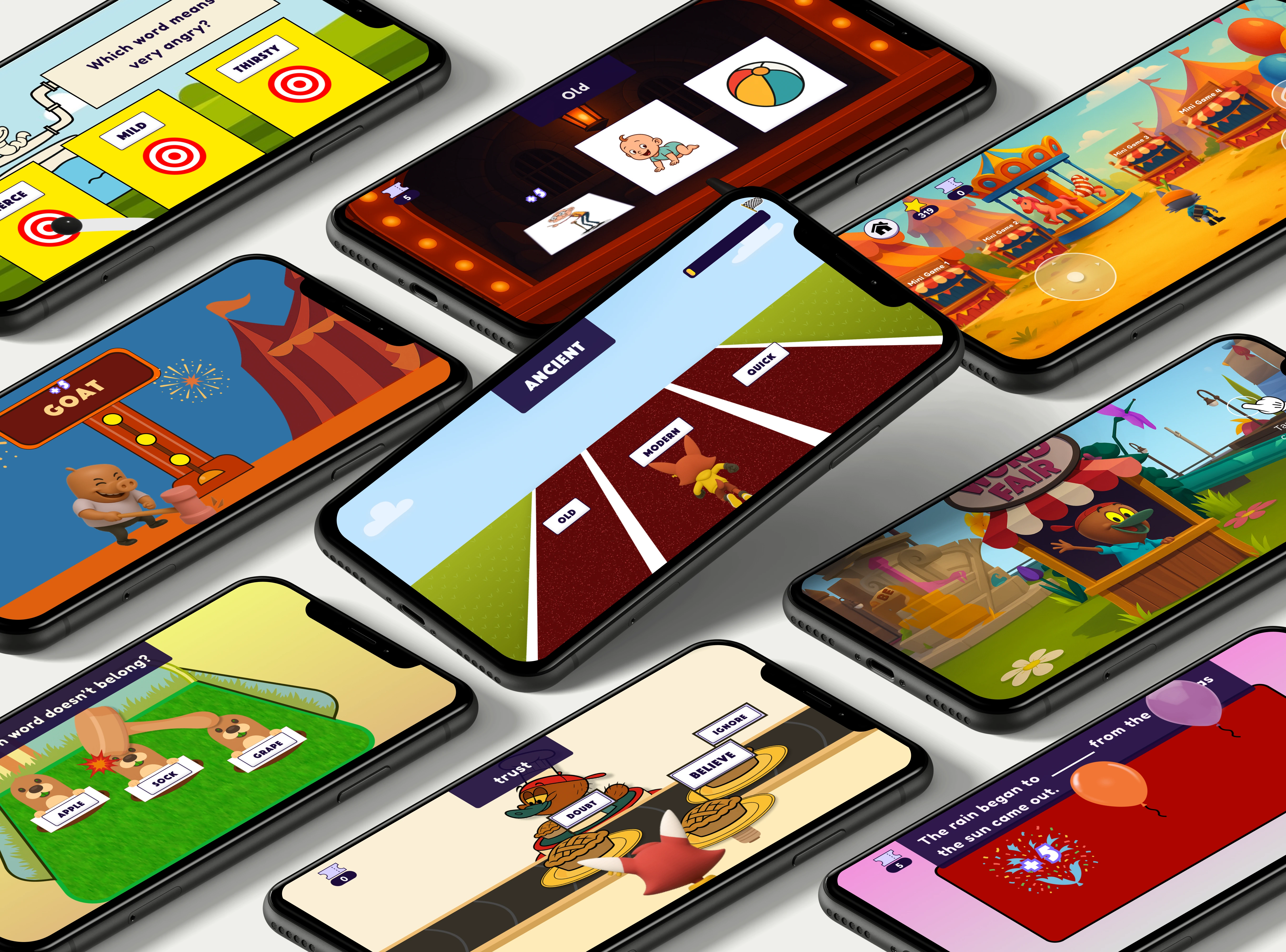
Open Learning Initiative
Timeline:
Sep – Dec 2025
Role:
Product Designer
Impact
A Unified, accessible foundation
I transformed fragmented "shadow components" into a validated, scalable library where inclusive design is the structural foundation. By clarifying previously undefined interaction patterns and establishing a shared resource for the team, I ensured that every future project begins with a baseline of WCAG 2.1 AA compliance, allowing the team to move away from guesswork and focus on high-quality iteration.
100%
documentation coverage
0
handoff friction
problem & context
Systematic foundation for long-term ADA compliance
Torus faced a critical deadline: under the ADA Title II rule, the university was mandated to bring all platforms into full WCAG 2.1 AA compliance. While engineering was applying manual patches to the production environment, I was brought in to lead the accessibility overhaul of the design system. Within two months, I moved beyond reactive updates to architect a "Compliance by Default" framework—establishing the documentation and core component standards needed to ensure all future developments inherently meet federal accessibility mandates.
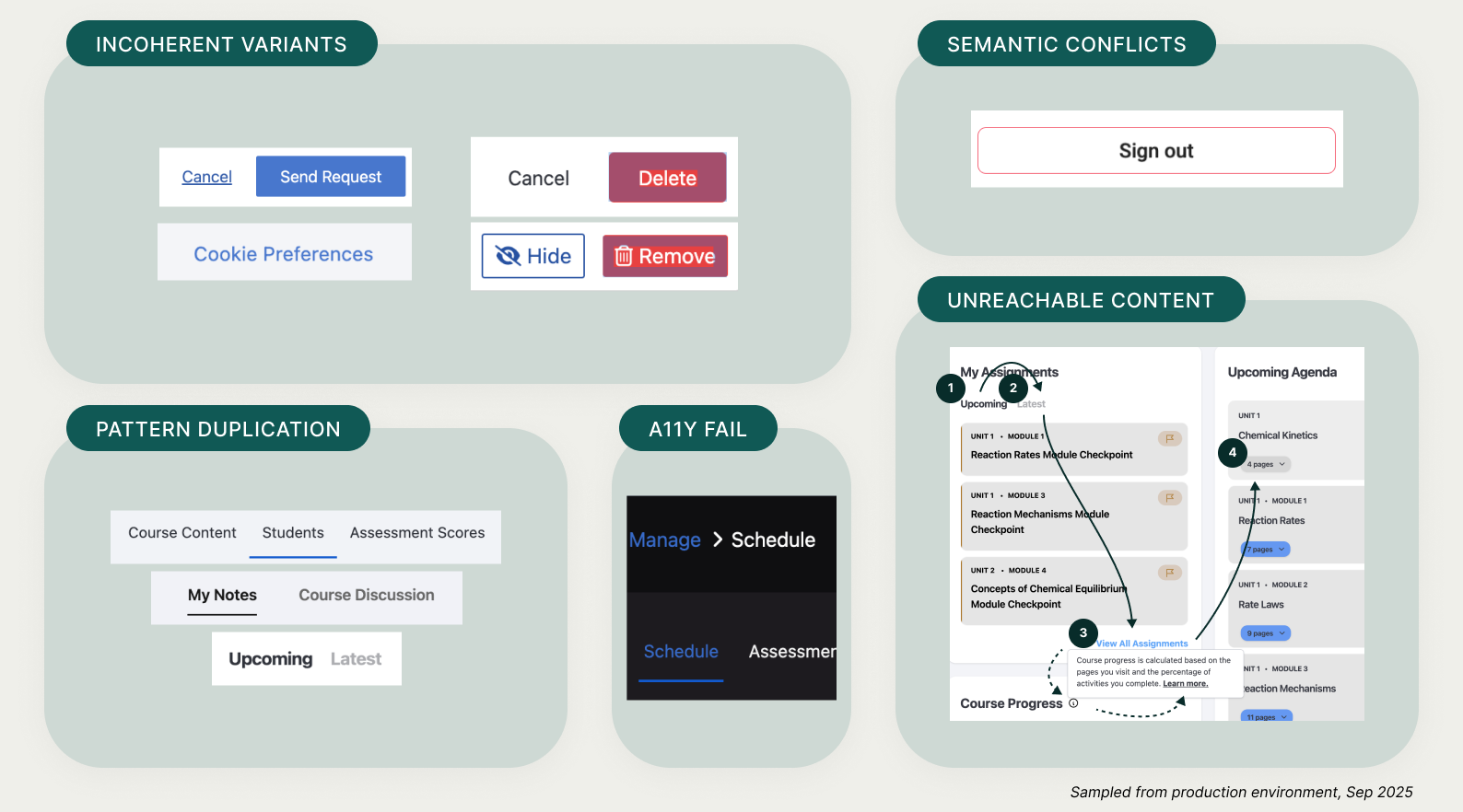
A diagnostic audit of Torus legacy patterns and accessibility failures
Strategy & Decision Making
Building a predictable foundation from the atoms up
I applied Atomic Design principles to decouple core elements from complex layouts. By prioritizing the stability of fundamental 'Atoms'—such as inputs and toggles—I ensured that even the most complex 'Organisms' remain accessible and consistent across the platform.
Prioritizing atomic building blocks to ensure scalable, consistent organisms
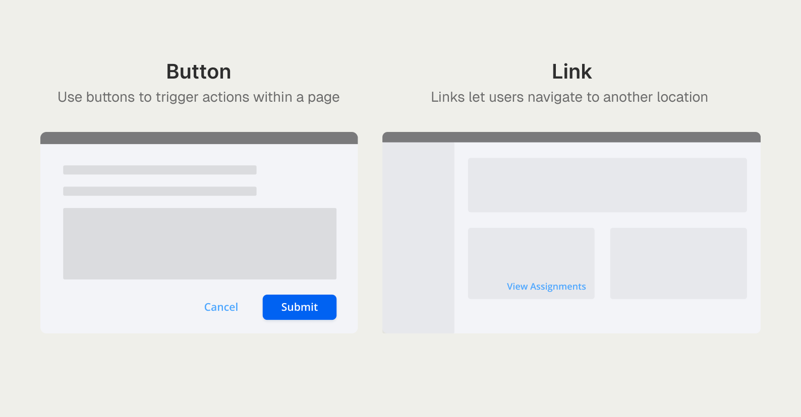
Solving the Semantic Divide
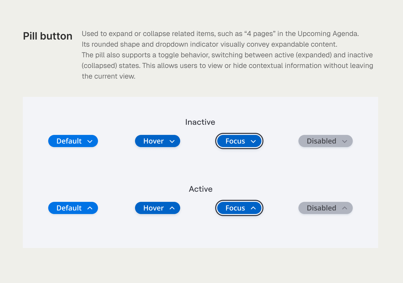
I established a strict rule-set to differentiate Buttons (actions) from Links (navigation). This standardization extended to custom platform elements like the Pill toggle, which I redefined from an ambiguous UI element into a predictable, state-driven component. By documenting its hover, focus, and active behaviors, I ensured a consistent experience for both visual and screen-reader users.
Differentiating between in-page actions and site-wide navigation
Standardizing the Pill toggle through a full set of accessible interaction states
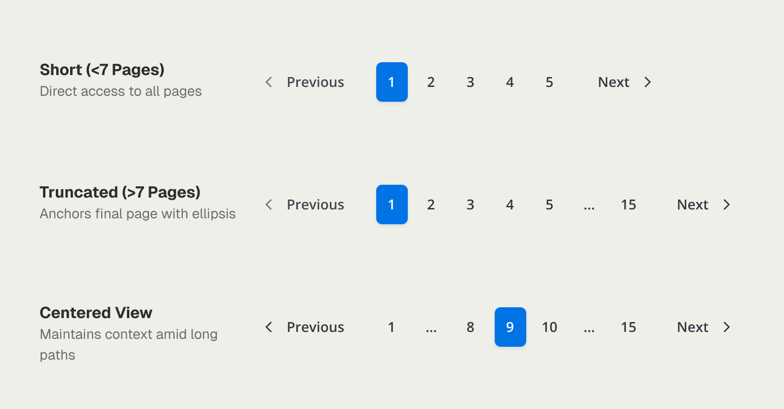
Architecting Navigation Logic
I architected the logic for Pagination and Breadcrumbs from scratch to handle diverse content depths. By defining dynamic truncation and centering logic, I ensured that students navigating via keyboard never lose their place, regardless of the course length.
Scalable navigation logic with dynamic truncation for complex content paths
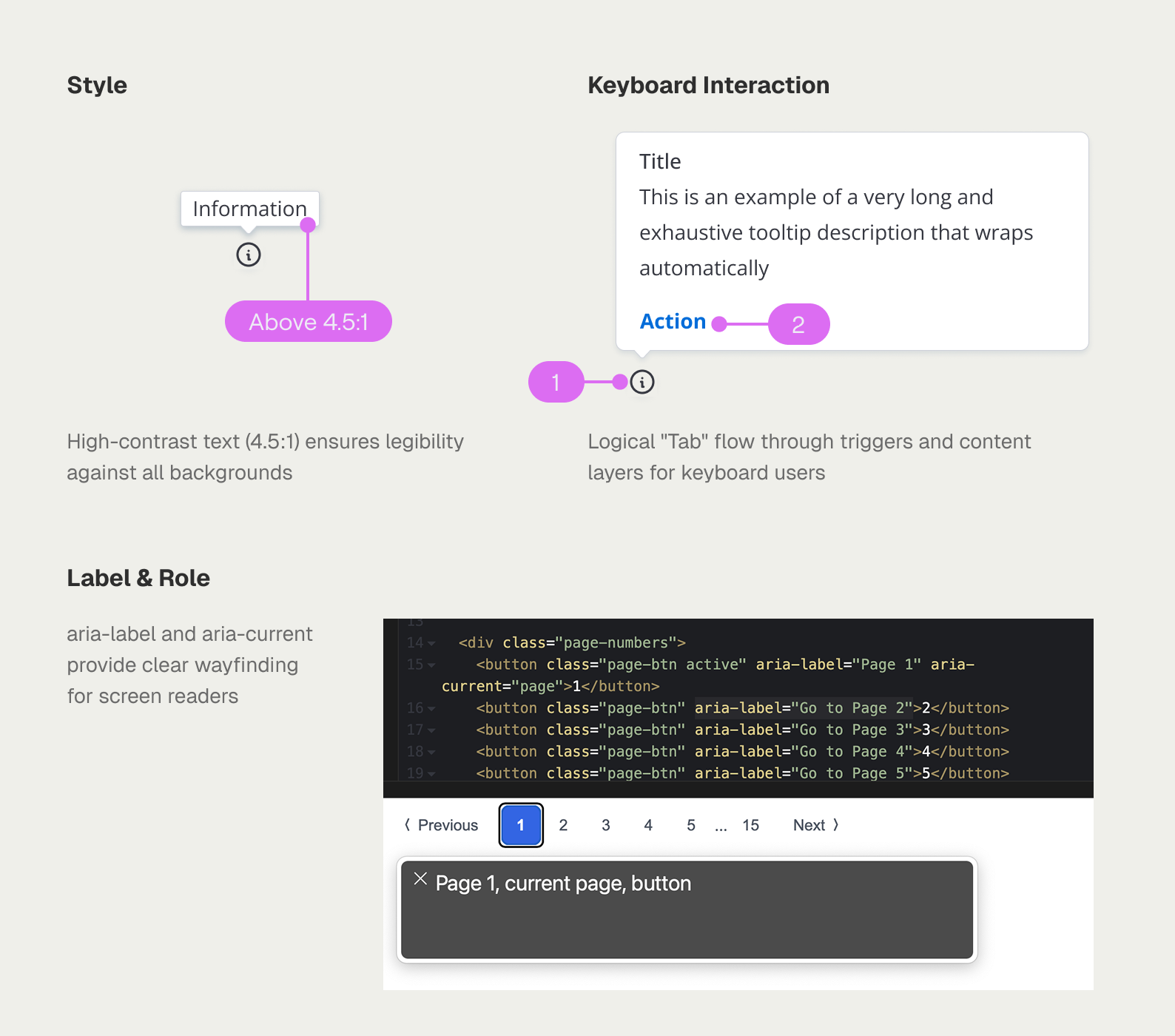
Defining the standard for implementation
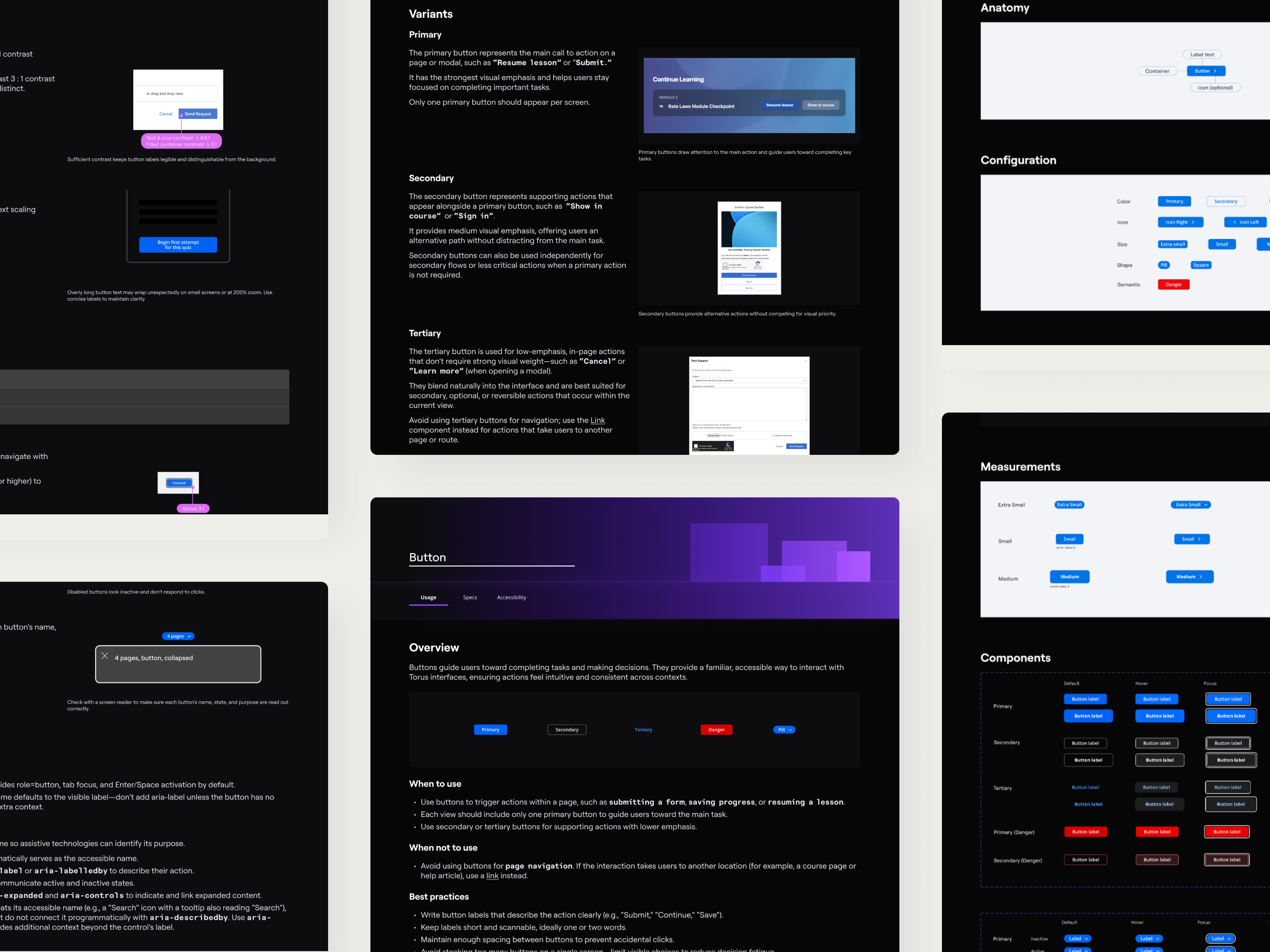
I moved beyond visual specs to document the technical 'how-to' for every component. By defining keyboard focus patterns and semantic ARIA roles—the exact details missing from the legacy system—I eliminated developer guesswork and ensured 100% WCAG 2.1 AA compliance across all new builds.
Standardizing technical specs to ensure WCAG compliance across style, interaction, and roles
solution
A self-documenting system that speaks the same language as engineering
The final solution transformed Torus from a fragmented UI into a cohesive ecosystem where every building block is inclusive by default. By bridging the gap between design intent and engineering execution, the system now provides a scalable, long-term foundation for inclusive learning experiences at scale.
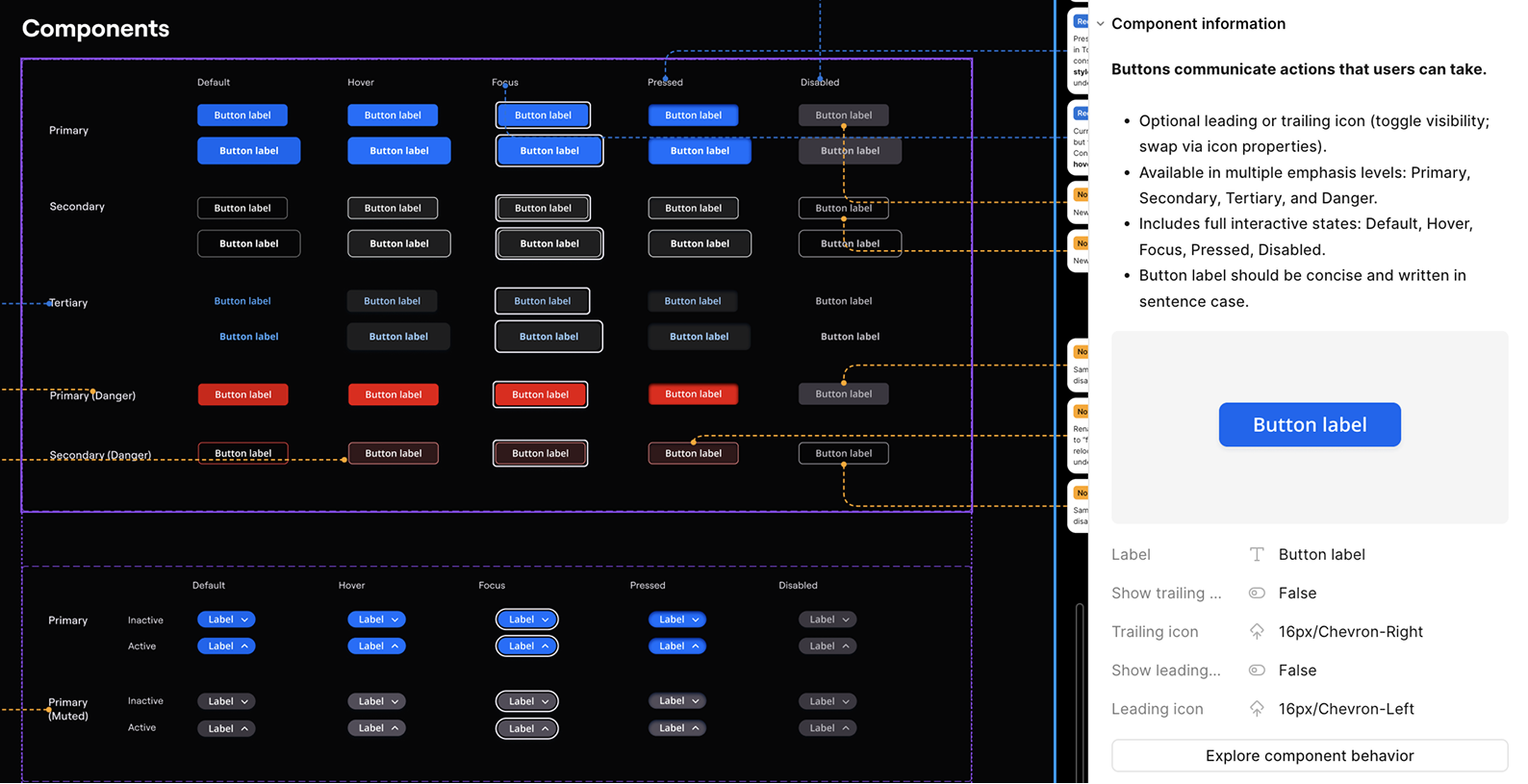
Self-Documenting Components
I integrated Usage Instructions and Logic Rules directly into Figma’s component configuration panels. This ensures that critical accessibility guidance is always available in-context during implementation. By creating this 'single source of truth,' I eliminated the friction of constant handoff meetings and prevented technical debt from entering the production environment at the source.
Embedding functional specs directly within component properties to streamline developer handoff
Scalable Accessibility Validation
Leveraging the Stark plugin, I performed rigorous contrast audits to verify every element across the library. I introduced standardized 'Danger-Red' tokens, carefully calibrated to remain WCAG-compliant in both light and dark modes. This token-based approach ensures that high-stakes failure states remain legible and accessible, regardless of the user's interface theme.
Standardizing "Danger-Red" tokens to ensure accessible contrast ratios across light and dark modes
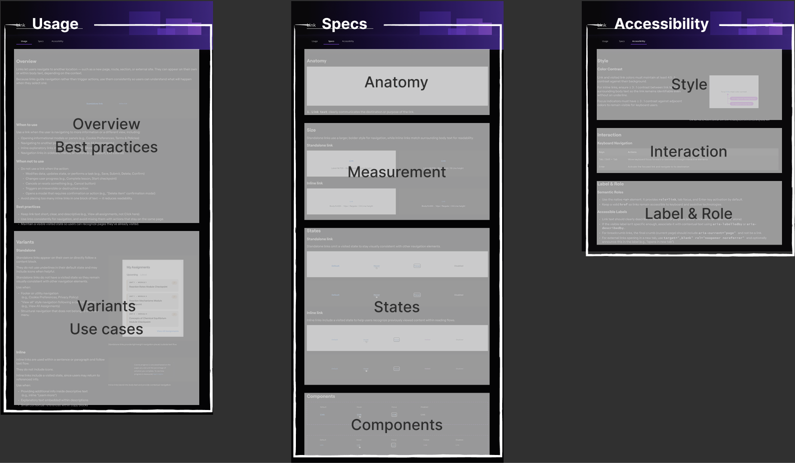
Establishing a Blueprint for Future Governance
To ensure long-term sustainability, I established a governance framework by standardizing the documentation structure itself. By defining exactly how visual specs, interaction logic, and accessibility rules are recorded, I provided a repeatable 'playbook' for the team. This ensures that as Torus continues to scale, every new component will meet the same high bar of inclusive excellence.
A standardized documentation framework designed as a repeatable template for future system growth
reflection & what's next
A design system is only as good as the instructions that come with it
This project was a deep dive into the massive technical and communicative effort required to build a functional design system. I realized that the real challenge isn't just building components—it’s designing a tool that empower others to build accessible experiences without needing a meeting.
I spent significant energy ensuring my guidelines were clear and "meta-usable," allowing the system to stand on its own as a reliable source of truth. Looking back, I’d love to take this a step further by conducting usability testing on the system itself—observing how other builders interact with my documentation to construct new layouts. To me, that is the ultimate test of a sustainable, human-centered foundation.