I led the redesign of the Carnegie Mellon OLI website to turn a fragmented "content dump" into a cohesive narrative for educators. By overhauling the information architecture and refining the content strategy, I transformed a complex resource hub into a purposeful user journey that clearly communicates OLI’s value at a glance.
project specs
context:
Open Learning Initiative
Timeline:
Jan - Jul 2025
Role:
UX Designer
Impact
A foundation for growth
The redesign replaced a legacy "content dump" with a framework that finally tells the OLI story without overwhelming the audience. By prioritizing natural flows and easier maintenance, the new site reduces user friction and provides a scalable system for the long term.
76.9
SUS score
0
design debt
problem & context
When users can’t find what they need
The OLI website hadn’t been updated in over two years, leaving cluttered navigation and disorganized content that overwhelmed even its core audiences—educators, students, and researchers. Many arrived unsure of what OLI actually provided and struggled to locate resources.
Meanwhile, OLI wanted to spotlight its unique strengths in Learning Engineering and research-backed course design. But if users couldn’t easily find or understand that value, the opportunity was lost.
We set out to redesign the site so OLI’s value was immediately clear, easy to navigate, and engaging to explore.
Strategy & Decision Making
Reshaping the structure for clarity
I started with the foundation: reorganizing the sitemap. Key sections like Educators, Courses, and Services were elevated to the top level, aligning user needs directly with OLI’s business goals.
Before (top) & After (bottom) sitemaps showing streamlined information architecture
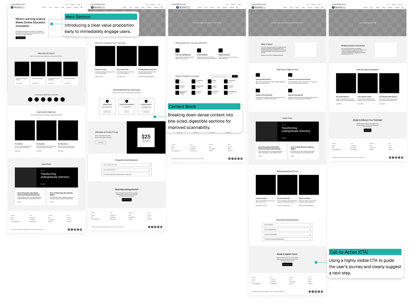
Guiding educator journeys with wireframes
Next, I translated the new structure into lo-fi wireframes. My focus was on intuitive layouts: digestible content blocks and strong calls to action guiding educators step by step.
Lo-fi wireframes illustrating educator pathways, annotated with design decisions
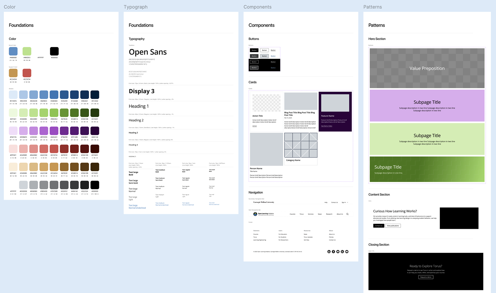
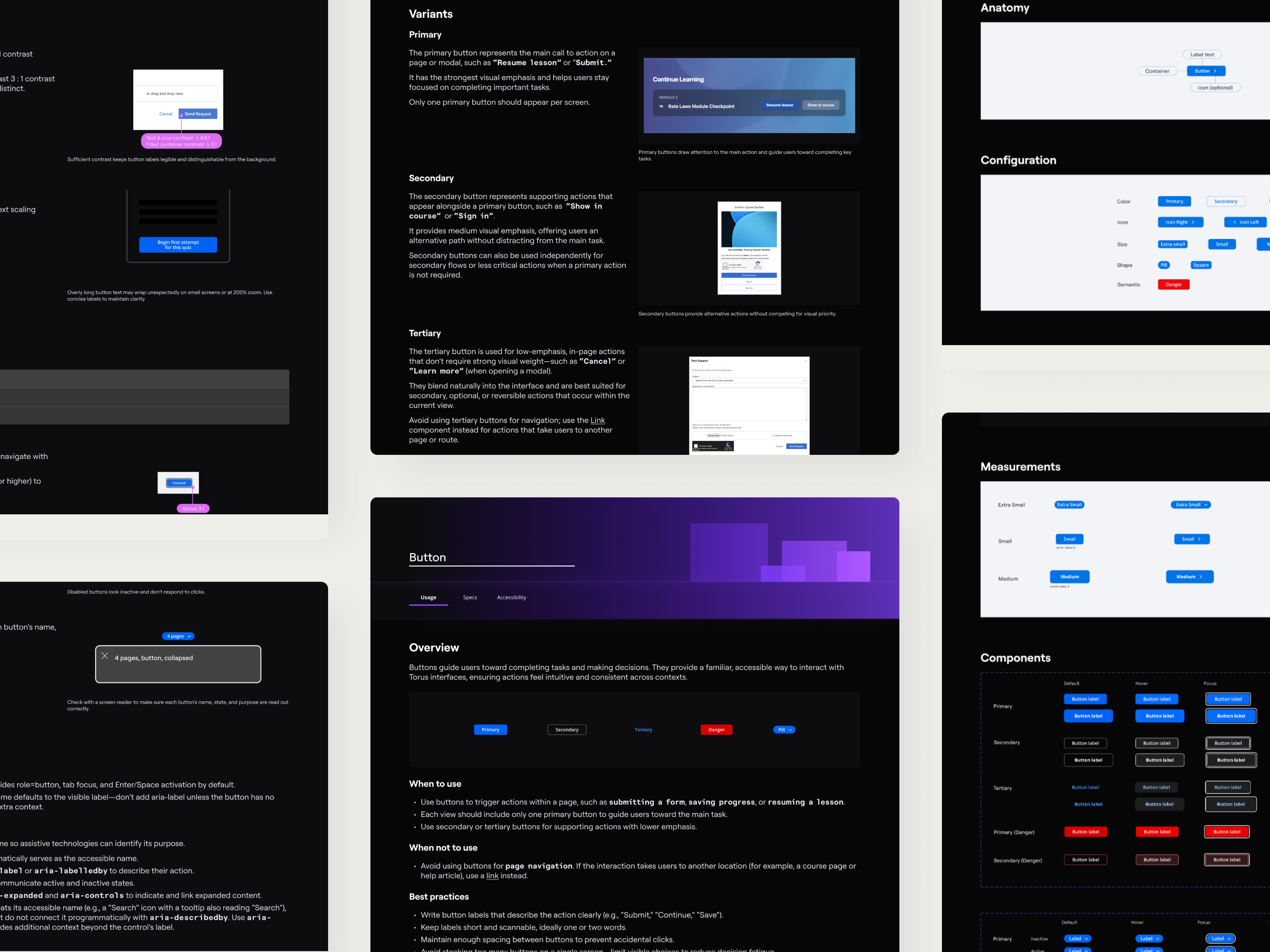
Bringing consistency to life with a design system
Once the structure felt right, I moved to high-fidelity mockups where I emphasized:
Hierarchy for easier scanning
Brand alignment to reinforce credibility
Accessibility to support inclusivity
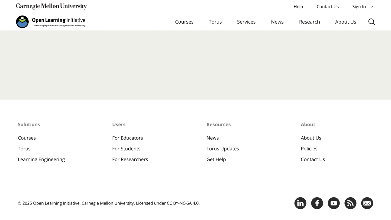
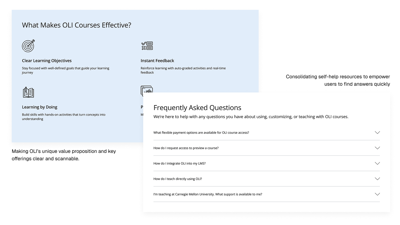
High-fidelity mockups showcasing clearer hierarchy and accessible visuals
To make the redesign sustainable, I built a design system in Figma. It included scalable typography, spacing guidelines, and reusable components. This ensured consistency across pages and made future updates simpler for the OLI team.
Key elements of the OLI Design System
solution
Launching a site that finally makes sense
With designs translated into WordPress (a process I led), the new site launched in August 2025. The final design delivered on its promise of clarity and usability:
Simplified Navigation
Clear menus and pathways make it easy for educators to find courses, services, and support.
Clearer Messaging
Content rewritten to answer educators’ top questions about OLI’s offerings.
Enhanced Discoverability
Prominent calls-to-action now guide users to relevant resources without extra clicks.
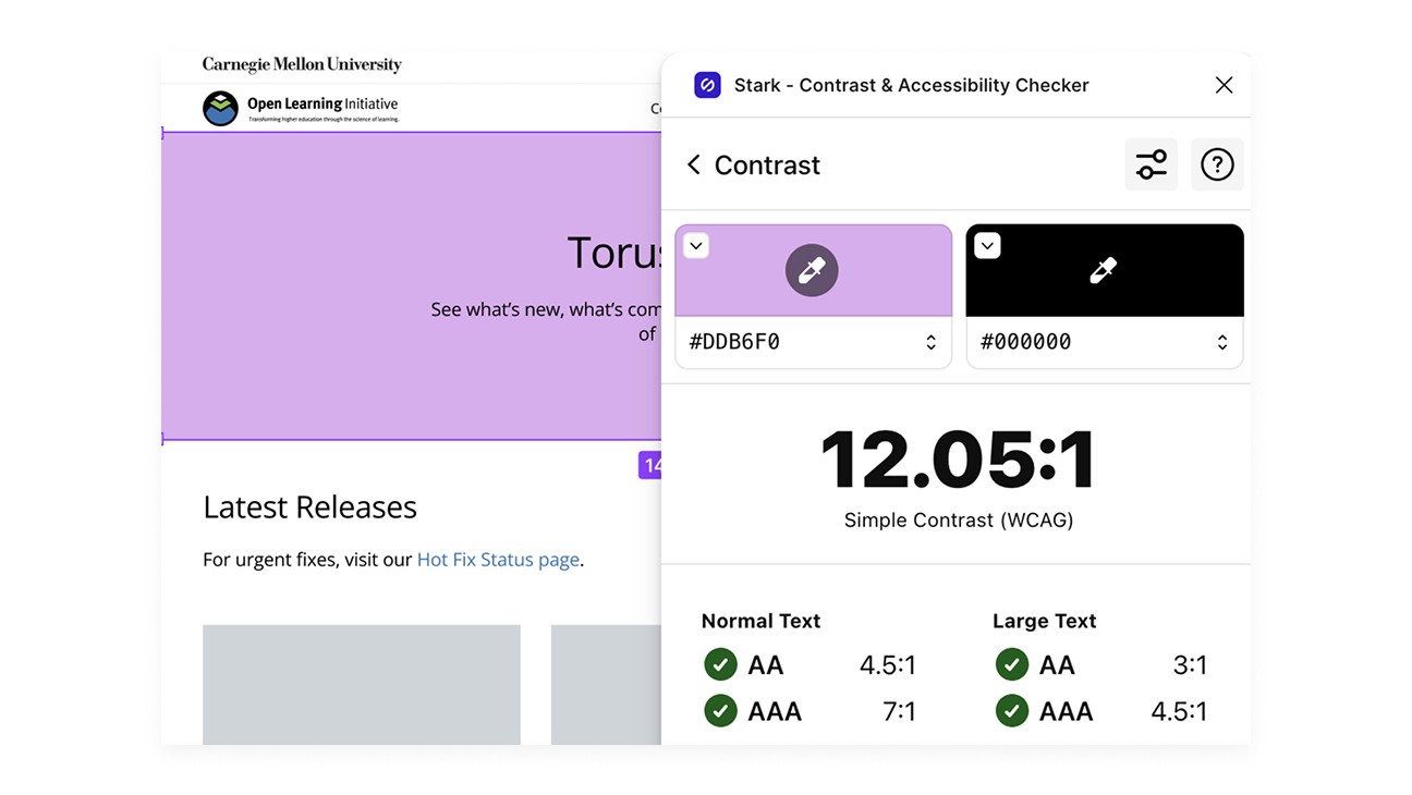
Improved Accessibility
A high-contrast palette and structured hierarchy ensure inclusivity, meeting WCAG standards.
Accessible color palette validated with Stark Contrast Checker
reflection & what's next
Learning to design for the long run
This project taught me that good design isn’t just about usability—it’s about sustainability. I created a detailed handoff guide so the internal team could update the site independently; their feedback—that it made updates much easier—was a highlight for me.
I also realized the importance of early testing. While I planned post-launch usability studies, I now see how testing the old site first could have uncovered more pain points. Going forward, I’ll always push for research at the very start, not just to validate but to shape the design itself.