I collaborated on ThinkBot, a browser extension designed to prevent mindless trust in AI outputs. By introducing "good friction" through lightweight, user-triggered prompts, I created a way for users to pause and evaluate AI content without breaking their flow. Through three iterative testing rounds, I evolved the interface to balance nudge intensity with user autonomy, ultimately achieving a high 4.4/5 score for deep, critical engagement.
project specs
context:
CMU HCII
Timeline:
Apr - May 2025
Role:
UX Designer
Impact
Subtle nudges, better thinking
ThinkBot proves that design can guide behavior without being intrusive. By refining the "nudge" intensity over three rounds, I found the sweet spot where optional prompts moved 100% of users to notice and evaluate AI-generated claims. The data shows a clear shift from passive "copy-pasting" to active critique, confirming that well-timed friction can effectively support human logic in AI-driven workflows.
69%
boost in interaction clarity
100%
nudge visibility
88%
deep engagement rate
84%
product-market fit signal
problem & context
Combating the Cognitive Drift
Students and early-career professionals increasingly treat AI as an “answer machine.” Copy-paste culture encourages System 1 thinking — fast, intuitive, and unchecked — while bypassing the deeper evaluation, reflection, and judgment we need for critical thinking.
Our challenge was to design a companion that interrupts this drift and helps users slow down, question, and think.
Strategy & Decision Making
When Ambition Meets Overload
Our first prototype was ambitious — packed with colors, scores, links, and prompts — but usability testing revealed that more wasn’t better. Users liked the idea of “dig deeper” nudges, yet too many cues created overload and hesitation. We realized we needed to scope back, focusing only on interventions that guided reflection without demanding extra effort.
Our first prototype was ambitious, with multiple cues that caused user overload
Simplifying for Focus
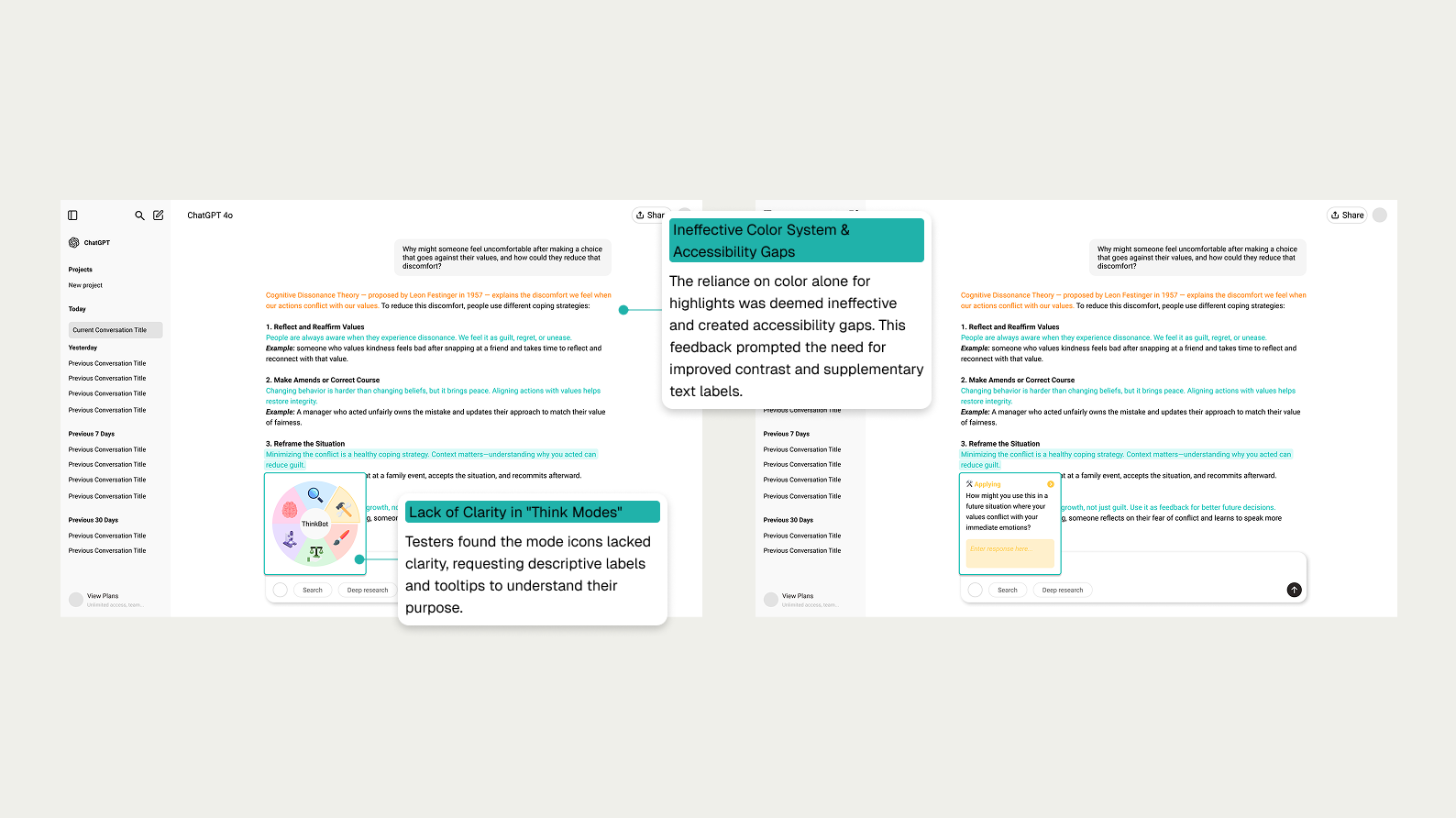
We then streamlined the system to two highlight types — Orange for objective claims and Teal for subjective statements — supported by a short onboarding flow. We also introduced an interaction model inspired by Bloom’s Taxonomy, giving users simple cognitive “lenses” to choose from. Testing showed the experience was clearer, but accessibility gaps (like icons relying too heavily on color) still caused friction.
We simplified the system to address feedback on clarity and accessibility
Refining for Accessibility
In the final iteration, we added clear text labels, improved contrast, and introduced a recap feature to support reflection without slowing the user down. Still, we discovered a subtle problem: the “ask/answer” buttons felt like homework. Even thoughtful nudges can feel like chores if they aren’t natural to the flow — a key insight that shaped our future direction.
The final design focused on accessibility and a natural user flow, empowering users to probe the AI
solution
A Subtle Nudge toward Deeper Thinking
The final version of ThinkBot came together as a set of lightweight features that fit naturally into the AI workflow:
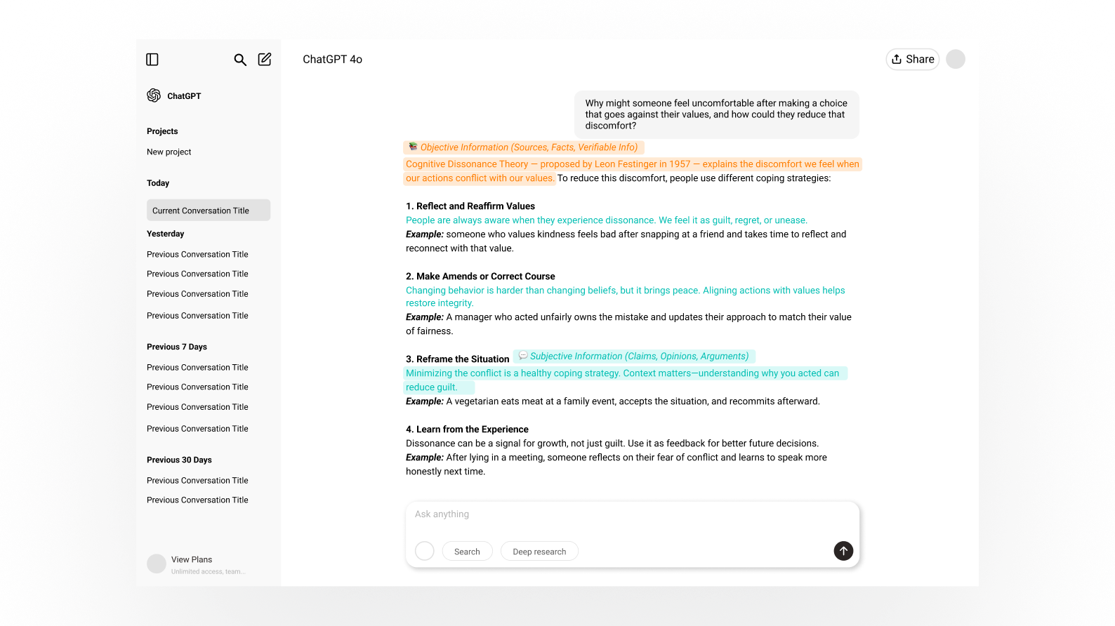
Color-coded highlights
Orange marks objective claims worth fact-checking, while teal flags subjective statements for personal scrutiny.
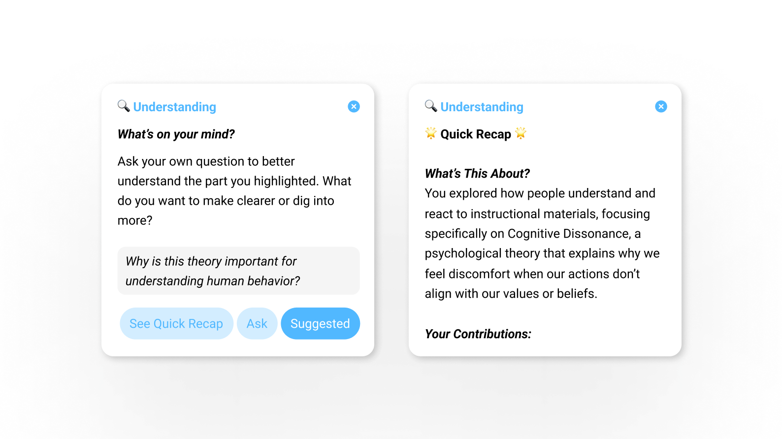
Bloom’s-inspired reflection wheel
Hovering a highlight opens six cognitive lenses (Remembering → Creating) to prompt deeper engagement.
Onboarding flow
A short guide explains the highlight system so users know how to interpret cues.
Recap summaries
At the end of a session, users receive a concise overview to reinforce reflection without slowing them down.
reflection & what's next
Designing for Human-AI Collaboration
Looking back, what makes me proudest is that our design really did meet the challenge we set out to solve: helping people pause, reflect, and not just copy whatever AI gives them. We didn’t create a perfect solution — some ideas still felt like homework — but we proved that small, thoughtful nudges can shift behavior in meaningful ways.
This project also reminded me that good persuasive design doesn’t shout. It respects the user, fits into their flow, and quietly encourages better habits. For me, ThinkBot isn’t just a course project. It’s a glimpse of the kind of human-AI partnership I want to keep designing for — one where technology doesn’t replace our thinking, but helps us think deeper, learn better, and feel more in control.