
We’ve all been there: staring at a journey map, convinced we know exactly what the user needs because we’ve "empathized" with them. As a designer with a background in Learning Experience Design and Product Management, I’ve spent years advocating for the human at the center of the screen. But during a recent deep dive into the Carnegie Mellon HCII website ecosystem, I realized a hard truth: empathy is a great starting point, but without quantitative data, it’s just an educated guess.
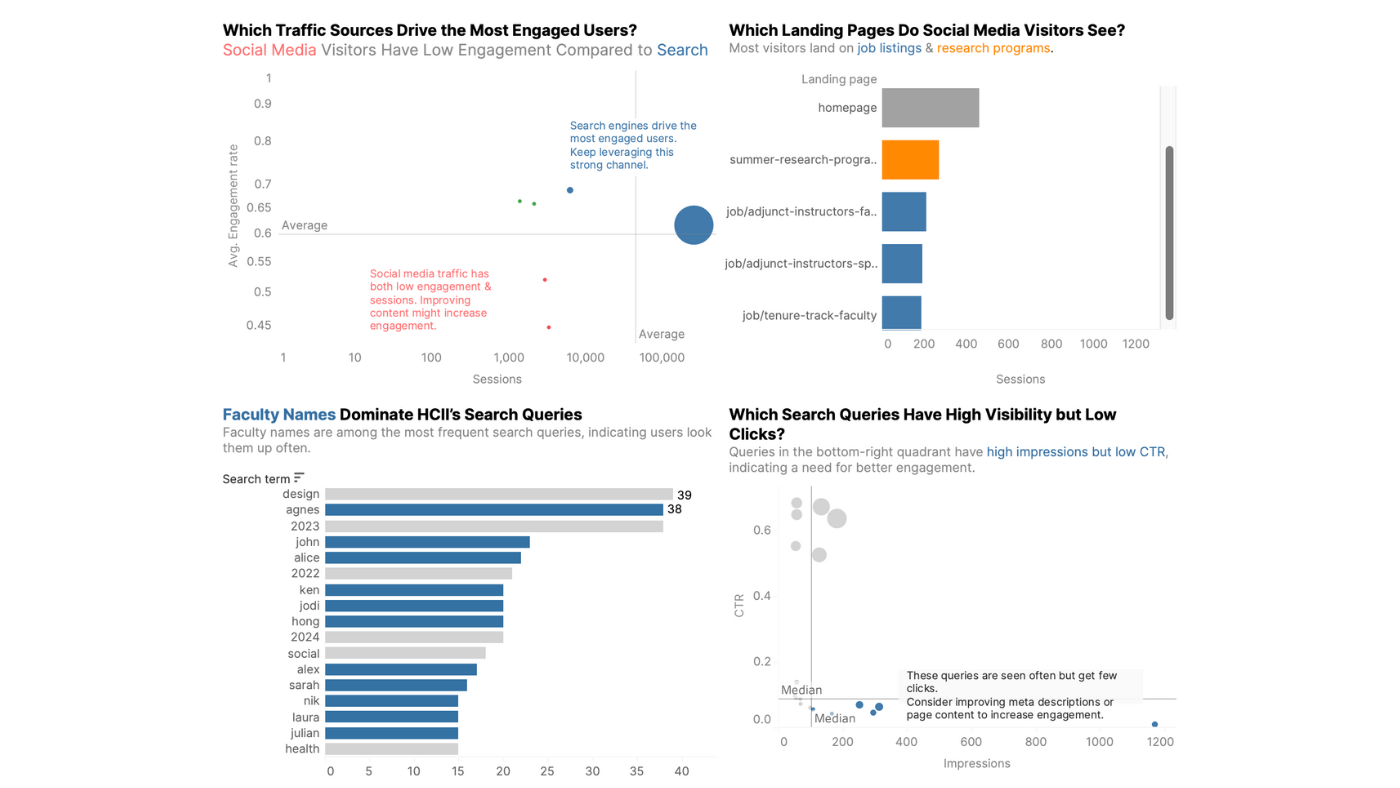
When I first approached the HCII site, my "designer’s intuition" told me that prospective students were the primary friction point. I spent hours imagining their struggles—because I was one of them. But when I stopped looking at personas and started looking at Google Analytics 4 (GA4) and Crazy Egg heatmaps, the data told a completely different story.
The $0 Assumption: When Bias Blinds Design
I assumed users were getting lost in program FAQs. The data showed that while "People" pages were among the most searched, they had the lowest engagement. Users weren't struggling with information; they were struggling with discovery.
UX is ultimately about supporting a business—whether by making money, saving money, or improving service. It all comes down to the bottom line.
This shift from qualitative comfort to quantitative clarity is where true product impact happens. In logic-heavy systems, we can't just design for "feelings"; we have to design for flow efficiency. I had to move my analysis out of the sketchbook and into Tableau, turning "digital dust" into purposeful visualizations where colors and clutter disappeared to reveal the real narrative.
Designing for Intent: The Auto-Complete Strategy
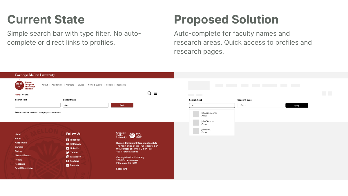
The data revealed a glaring discrepancy: people were searching for specific faculty names and research domains, but the search results were a cluttered mix of blogs, news, and events without clear organization.
I realized that a first-time visitor trying to find a faculty member they partially remembered from a conference was hitting a brick wall. This wasn't just a "usability" issue; it was a barrier to the university's goal of fostering industry partnerships and research collaborations.
The Proposed Intervention: Metrics-Driven UI
Instead of a full site overhaul, I proposed a high-impact, low-effort MVP: an auto-complete feature for the search bar specifically for faculty, research areas, and common queries.
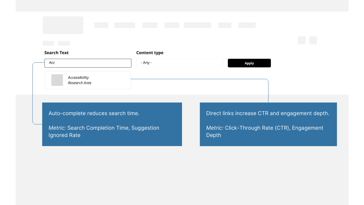
But a design solution is only as good as its measurement plan. To validate this, I established four key metrics:
- Search Completion Time: Measuring the efficiency of the new auto-complete.
- CTR on Suggested Results: Validating the relevance of the AI-driven suggestions.
- Engagement Depth: Tracking if users actually reached the faculty profiles they were looking for.
- Suggestion Ignored Rate: A "negative metric" to help us pivot if the suggestions were unhelpful.
Strategic Takeaways for Product Teams
- Audit Your Biases Early: Use GA4 and heatmaps to challenge your initial personas before you even open Figma.
- Translate UI to ROI: Every "nice-to-have" feature should be tied to a metric that affects the business, whether it’s reducing time-to-task or increasing conversion.
- Design for the Edge Case, Validate with the Mean: Use qualitative interviews to find the "why," but use quantitative data to decide if that "why" happens often enough to justify the build.
The New UX Standard: Why Data is the Ultimate Advocate
Transitioning from purely qualitative LXD work to data-driven Product Design hasn't made my work less human—it’s made it more effective. By embracing the "math" of UX, we ensure that our designs don't just look good on a slide deck, but actually move the needle in the real world.
Are you building a complex system that needs more than just a "hunch"? Let’s connect on LinkedIn to talk about your next UXR Audit